Demonstration of technical and visual skills, quality of outcome, demonstration of creativity –
You did well to produce this body of work in a short time. You have approached each exercise with thought and tried iterations of ideas. There could however be further investigation in the exercises , the body of work feels a little bit light but i am sure this is due to a lack of time and not a lack of ideas.
It might be that you should separate out some of your more resolved or successful pieces and mount simply on cartridge for assessment. For example your self portrait, the rubbing of your letter, the rubbing of the leaves in your environment. I shall confirm from Sandra if this is a good idea.
You experimented well with a variety of materials and processes. You handled line well in the initial drawing exercise. You produced a strong graphic composition.
The photos of the found marks were very successful. You observed very interesting textures, colours and compositions in these images. Think about how you instinctively did this with the camera frame and how this could be applied to samples you are creating.
The end of the sketchbook felt a bit rushed and scrappy. Please make sure papers are either in the book attached, out in a separate book or just placed in a simple fold of clean white paper acting as a sleeve. For assessment put details of the exercise neatly on the corner of the sleeve.
You presented your work well on your blog. It would however be helpful to have a paragraph of reflection after each exercise. ( you started to do this in the last couple of exercises)
Please give more detail in your reflection for example you say that you were underwhelmed by a certain assignment, explain why you think this is.
You mentioned Tracy Emin and Elise Englar were important artists for you in this assignment, please explain why. What did you connect with in their work? Do you feel that your work was a response to this, if yes why, if not then why not ?
Please include the rest of the research artist analysis in the final assessment.
Well done, I look forward to your next assignment.
In Part Two you’ve produced a body of written and visual research and drawing exploring the themes identified in Part One. You should now conclude your work by reflecting on what you’ve learnt in Parts One and Two. Write about the development of both your research and creative skills, and identify what you think you’ve learnt from undertaking these exercises. Discuss how research has broadened your understanding of the creative process, and how exploring a range of different creative approaches to drawing and mark-making can help you to generate ideas
in response to a theme. Highlight areas of strength and any areas that you think require further development. You should aim to write approximately 500 words, and include this in your learning log.
This was a tricky journey that I have taken very quickly. merely dipping my toes into a range of processes and concepts for generating ideas has whetted my appetite for researching ways of developing thought processes.
I was particularly struck by the Martin Creed video
The main thing I have learnt is not to pre judge. The process of immersion in a task , being inquisitive, questioning and ready to experiment can yield results I couldn’t dream of – dreaming up ideas is a bit of a fallacy perhaps! It is a skill that can be honed,
I have quite a good understanding of critical reflection , my research for this assignment is not complete, currently a collection af annotated images and rough notes from many open tabs on my computer. I did not approach the research systematically but all at once and it blew my mind, brain fog, my short term memory just couldn’t cope I need to develop a strategy to cope with this. Currently I’m Using Microsoft notes as a swipe file to gather information, make notes and gather images but collation is proving complicated. It Is my priority for moving forward. It is clear that the research I have managed has been key to unlocking concepts and revelations so not committing enough focus to this will be a barrier to fully realising my progress.
My creative journey falls between , Tracey Emin strongly expressive of personal journey, highly emotional. Vs documentary/archaeological approach of Elise Engler.
After really enjoying MMT I felt very materials and process led but now see that the ideas and process led approaches have generated thought processes in ways I haven’t really considered. The pieces of work using collage resonated more , I guess this was more to do with manipulation of materials, also very colour and composition based. Words weren’t for me but actually the frottaged stitch sample was a favourite piece due the interesting surface texture, I wish I’d frottaged in white on a light background to further investigate the the shapes found.
Researching the work of Lucy Freeman I found an artist statement on artsthread.com
‘Portfolio Lucy Freeman
Summer 2016 Collection ‘Wish I was there’
‘Wish I was there’ is an interiors collection exploring escapism and child-like optimism, creating bold, vibrant imagery evocative of tropical holiday destinations, but in surreal dreamlike compositions, creating only an abstract, unattainable visualisation of a joyful and playful place we dream to escape to.’
This statement could be a basis for the way I decided to approach this final task.
But , without the tropical holidays, think more verdant fairly rocky geological wonderland with layers of history, quietly crumbling beneath the surface…..
I think that my printer tends to tone down colours as the photos I printed out aren’t as vibrant as on the iPad, however my found drawings tended towards neutrals with lots of greys and browns. I used a colour identifying app on a couple of the photos to see if I could pick out key colours and got more neutrals than the colour pops that had drawn my eye, as they formed the largest proportion of the images. I wanted to work with some more vibrant shades so picked two photos to work from,
a natural lichen and a distressed man made surface. Within ares of the photos it’s difficult to observe a specific colour because of shadows and highlights.
I observed that the same grey was very noticeable in both photos.
I referred to a colour mixing exercise from ATV to match the colours , a really pleasing process and I was very happy with accuracy.
Looking for these shapes and feeling in the frottage and found drawings collection. I drew some bold forms based on all the found drawing pictures.
From this I cut a number of elements and arranged them loosely in different configurations on different backgrounds.
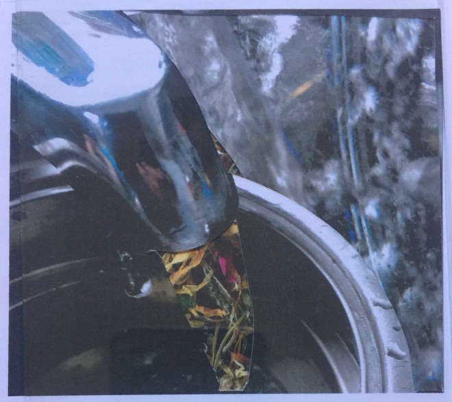
I also printed these out in monotone , the grey background almost swallowed up the collage pieces as the colours were tonally similar. I felt the white background worked reasonably well, the colours appear very pastel , against the black background they are more vibrant.
Final iteration on A2 black card, the top image is quiet and calm.
With additional colour pop of red circles the energy is completely changed, the image is much more dynamic.
Does it answer what is being asked of you?
This piece responds strongly to the brief. The process, followed systematically worked well for me in this project.
how can you develop your ideas ?
I could work with colour selection, although I carefully matched colours to my found drawings, the resulting palate is a little whimsical and not particularly sophisticated, probably not a combination I would have instinctively work with. Obviously colour choice depends on purpose. This piece is quite strongly commercial I think, it’s quite Scandinavian I would like to think Marimeko but perhaps more IKEA!
how can you revisit the work to improve
I was careful to experiment with placement of individual motifs, and relied on gut feeling, I would like to develop a better understanding of the language of composition.
This assignment feels very much like working backwards. I’m very much an observer of my environment, the minutiae more so than the mighty. I got completely engrossed in gathering photos of found drawings. My first edit got them down to 93. I hesitated to make a quicker decision to narrow down to 10 as I couldn’t really understand the process I was supposed to be going through.
I printed out 16 photos at a more observable size “to use them as a basis of drawings and image development.”
I unravelled at what using adjectives to describe physical (this is fine) and emotional characteristics means? I had to find some words to use to steer away from being repetitive. In my sketch book I observed the similarities or groupings in the chosen images. Had I pre planned I would probably have taken different images –
Another way to approach this would be to choose emotional/physical words and go in search of images that fulfill the description.
This felt like cheating somehow ( I’m still very much stuck in the rut of taking the course notes too literally.
One by one I selected images that I could choose adjectives for, I made some very quick marks and drawings and found that this process of choosing media and drawing what I saw actually inspired more words to respond to. Ha! Result.
Dappled
Bumpy, encrusted
Meandering
radial, radiatingFlowing
Having identified many words… I intend to respond to a variety rather than all at this time. However I feel that this process can become part of my independent sketch book work as I’m clearly seeing the value in this approach. The process of seeing an interesting shape is a starting point, attaching emotional/descriptive words demands more inquiry, mark making in response to deeper enquiry is the start of a dialogue.
Perhaps I should be less anxious about the course notes. These exercises are a starting point and will inevitably lead each of us on a slightly different journey, there may be no right or wrong. Splendid.
Elements to consider-
1) surface texture
2) pattern and shape
3) colour
Does it answer what is being asked of you?
I have responded to the brief by observing my environment and photographing found drawings. I have observed the emotional/descriptive qualities and responded with mark making.
how can you develop your ideas ?
Continuing to develop skills of forming a dialogue , understanding the narrative that is formed from my personal response, investigating that response with material investigation and experimentation.
What are you trying to achieve in your samples/ art ?
This is very profound!!! – the answer to life itself? Self understanding?probably acceptance?
have you achieved it? if not why?
I’m obviously still searching for what I’m trying to achieve, I’m working towards finding a personal voice. I’m very much in toddlerhood, riding the creative wave looking for answers. My understanding is that achieving a goal is possibly not the goal I’m searching for…. ever learning and looking is the creative process.
how can you revisit the work to improve
Practice. I think that improvement may not be cyclic , more spiralling application of learning to future works, working with a theme is a strong pattern for artists in art movements through history, Monets’ Lilly ponds for example.
A photocopier has a very personal sound, they are all so different!! I have honestly been compelled to dance to rhythm of a large school copier- perhaps choreography would be an interesting way to record sound?
I found too many parts to the noise to make individual marks and the resulting up and down lines are just the same as noise/time graphs. I found making rows of marks broke my concentration so cut lengths of paper from a roll to make continuous drawings.
I stalked a chainsaw, a sad sound, the death of a tree. It seemed less regular than I would expect, just being held still was a steady sound, engaged with the wood not so steady and obviously the starting and stopping were different again, a very linear story and I was compelled to record it in a linear fashion, first with a very broad marker – harsh and precise and then a graphite stick , softer and closer to nature.
An attempt to record more accurately I used oilpastel , drafting film has a smooth surface so the oil would smudge, a lovely quality to this line, combined with colour, fresh blue, I think more representative of boiling water. Still very graph like.
We are all machines, if not mechanical. Whilst listening out for machine noises I found nature sounds creeping into my awareness. I videoed an overflowing stream observing the repeat splash of a branch being pulled down stream and springing back, perhaps the most regular sound I heard, and then other patterns of the stream started to punctuate, my mind would be drawn away for a while and then the branch would again intervene, a crow cawed…. a true symphony. The stream overflowed because of endless rain. I will revisit and contemplate how best to capture the feeling.
With closed eyes a waterfall sounded exactly like a steam engine (rather than a steam train) which made me wonder about how we engage all of our senses when we engage with an art work.
recording sound is very different to representing sound. If representing sound I could break away from a linear format .
Using a hammer and mark making tools.
Using more gestural marks
Using more dynamic marks.
This would be a more reflective than recording process.
I diligently got my mom and sister to write over the top of letters and photocopied and enlarged, rotated , overlapped by photocopying onto photocopied paper to arrive at a range of papers. I didn’t become excited by this process.
these manipulation s in an app called MegaPhoto are an excellent example of getting carried away!!!
I feel that there is a not so fine balance here of artistic intent and very clever technical wizardry that leads you down a path of distraction. I’m guessing that , if avoiding those dangers a spark of an idea could be created.
I imported one of the images that I had manipulated into the Procreate app and block coloured the background, then created a tiled pattern. Nothing spectacular, however I can see that with some experience there is scope for using digital manipulation as a useful tool. As I noted in the collage project there is also a danger of getting lost and carried away.
Cutting holes and reassembling , I haven’t investigated very thoroughly, for example the holes could be circular. Different sizes, random, I could weave , rip , shred – actually veryfine shred rearranged appeals- this is an example of the process of experimentation working!
I chose a section of the overwritten letter to explore further by stitching over the top onto a piece of cotton voile. The reverse of the stitched piece has much more textural interest than the electronic manipulation, the loose threads and dots of black thread pulled through to the back are much more interesting than pixels to me. Using frottage to rotate, offset and repeat in a different colour has given an interesting set of drawings.
I needed to soak the photocopy paper to remove sections, with thinner paper I could remove this more easily and achieve a wider selection of negative shapes, texturally this reminds me of the bark of a plane tree.
Reflecting on the creation of further letters, I had considered writing to my younger and older self, this ties in with links to ancestors in the collage project. Asking myself the question of who am I?- we are a sum of many parts. This collage is of me with the combined letter from my mother, my sister, myself.
I got more from this exercise than I expected as to be honest I just wasn’t inspired at all by the brief and went through the stages quite mechanically. There is some real strength in the stitched and frottaged piece and I certainly wouldn’t have got there without the earlier processes.
For me the textile related pieces are more interesting visually, they have more gravitas and feel more intentional. The graphic pieces have more of a feeling of accidental design, more contrived and less interesting.
some of the difficulty here was the personnel nature of using a letter, this felt too intimate and exposing of self. The ability to do this, is part of the success of many artists, Tracey Emin is a clear example of not holding anything back. Art can be cathartic in this way.
This exercise was mind mapped before I recorded any daily routines, I don’t really have any obvious daily routines so there was no really strong contender. I thought perhaps something I do regularly may work as a source of images, purple cabbage is a remarkable colour to play with so I recorded making sauerkraut, this didn’t seem to fit the bill however.
Neither did eating breakfast, this just seemed contrived and a bit embarrassing as well as really awkward to take photos of.
I settled on making a cup of tea, this is probably the closest I get to a routine, actually it almost approves ritual, I have recorded the process in my sketchbook in more detail.
I eventually settled on a concertina book format for the images, I tried to use a range of papers that would tell the story of the process and evoke something of an air of calm and relaxation. I used a combination of handmade papers relating to the tea ingredients, these were quite heavy so I added some airiness with drafting film, also some sections of a monoprint of a teapot and flowers . My intention is to put it in a mesh bag -like a teabag would be to stop it unravelling and to add something of the tea ritual to opening and reading it.
I do feel that actually the end product is a little clunky, using a square viewfinder to crop the images abstracts them a little and I would stick with square images but simplify the pages .
I was underwhelmed by this body of work, I was a little bit stymied by finding a routine to use, I think that this just made the work a bit forced, deciding to use a cup of tea making was the best choice for me – perhaps it’s a bit more ritual than routine, however it still seemed like hoop a jumping exercise even though I managed to find some interesting shapes in the photos that are sketched . I could enlarge and abstract the images further to find elements to pursue further.
He talks of the inspiration for his collages being a conversation with his mother who told him that people are made of flowers.
His work is about inner beauty. Cut outs in portraits reveal beautiful blooms beneath the public face of celebrates that he often works in collaboration with. It takes two days to produce a piece of work. In the interview he would spend much longer as he worked out what photo angles and cut marks worked.
Working with collage , I feel the tentativeness of Montreal’s early work. I enjoyed the process and can envisage using it more.
I made a decision to only use one magazine as source material along with a folder of papers that I started collecting for collage project in ATV – it pays to hoard art materials.
During the selection of images to use, I started by looking for colours but soon observed that my bigger interest was in making connections with the object I was collating, for example
-using images of hair to make the hair slides
-trees became pencils
– a tiger became sharpener
-the pen knife blade is a flower – only to be used peacefully
– key to ancestors -bone
– key to the universe =stars
– key to living in a capitalist society =gold
I found the selection process very meditative, there seemed to be a clear dialogue between me, the object, and the medium.
I documented my bag as I found it that day and was surprised more by what it lacked. The resulting drawing felt quite anonymous, different to other bags , however not particularly telling a full story, some clues to me but not a clear identity. I guess this is actually a fairly accurate summary of how we see people or situations, our own eyes cause our brains to form impressions however what is missing is a large part of the picture. We can present an image that we would like people to interpret but we can’t control what they will see. It is the same for an art work. Artistic intention may not be the same as people’s perception and this is probably ok. Before committing to glue, I played with placement of the collage pieces, this felt very cluttered, the purse hat kind of suits me though. I thought it quite clever that My sharp eyes are a sharpener made of tiger – eye of the tiger! I enjoy word play. I have a Victorinox smile. A transforming multi tool, sharp and cutting, I can open bottles with my teeth ( not really – that’s artistic license) speech is key, a key to open doors, to be understood you need to talk…..
In this orientation the knives are like little figures, whimsical, not dangerous. Bonkers!!! This clearly shows the importance of careful placement, I moved swiftly onto crazy head dress/hairwhile making the larger iteration of the owl – the universal /ancestral owl I cut a shape from a wolf image, I noticed that serendipitously fitted my face, I became wolf girl!what a fierce transformation. I think it looks quite complete as a simple collage of two shapes.e
I played some more and then committed the shapes with glue to produce this portrait.
Having selected the items from my bag that I resonated with most I think that this probably says more about me than the contents of my bag drawing which contained mostly utilitarian objects, a penknife shows my preparedness for every opportunity, my just in case spirit of girl guide, trying to do my best.
I love that a pen knife (it is a tiny 40mm) that transforms can be transformed to wolf or human or owl depending on the rotation. in my sketch book I wrote a little about owls and ancestry. A relative used to raise birds of prey for wildlife parks and I got to hand feed them so there is another link there. Making multiples of owls of varying sizes to show a succession of ovum’s passed through the generations was the line of thought here. I was so absorbed by this process I think I got a little mad!
The final collage image reflects the work of Marcelo Montreal. One eye to the future , one to the past. There are some really interesting repeating shapes and smooth transitions – the beak/nose for example. I’m pleased with the hand/claws holding the keys. The wing echos my face shape on the left while the owl face sits well with the right eye socket.
i played around a little with digital manipulation of my completed wolf girl collage
Obviously in the early days of collage computer manipulation wasn’t possible. This is crossing the boundaries into photography/graphic design/computer graphics and many artists are working successfully with these mediums. I definitely engage more with a hands on process.
Continuous line drawing is unnerving, however I think that the quality of drawing is really interesting.
The first couple of drawings are of the whole drinking bottle, I felt that the top half was more interesting so I just focused on the lid. Not retracing lines forced me to decide which part of the object to draw next, this decision really informs which bit of the drawing is recognisable! I found some interesting shapes in the two overlapping drawings bottom middle
There’s something about the cylindrical pencil sharpener drawings that reminds me of Picasso. Cubists portraits!
The teabag drawing is more interesting to me, perhaps I was getting more in tune to the process. I took it out of the sachet to get a more interesting object to draw. I hit on an object that really suited the process. The last one I drew resembles a wire drawing. I am reminded of the wire sculptures by Jeanette Orrell. I would like to make two wire teabags, one 3D and one as a flat drawing to compare them, I find the juxtaposition of flat drawings representing objects interesting related too wire sculptures representing a drawing….
I realise that I’ve used a biro for all drawings (suggested in the coursenotes)
I made a wire drawing based , flat and linear rather than a 3D sculptural shape. Mounted on teabag paper.
I would like to experiment with scale – it seemed natural to work sort of to scale but I should try a large drawing or a tiny version to explore that eye – through brain – to drawing implement connection.
Using a chunky graphite pencil will be fun, I’m also interested to use charcoal -I think that it will inevitably smudge which may make interesting marks.
I am reminded of the wire sculptures by Jeanette Orrell
I approached this task in a very straight forward way, I felt that the little penknife with the implements extended would work well. It gives many possible rotation points. I like the analogous colour scheme, obviously this has endless possibilities. Perhaps the nail file and bottle opener makes the image quite busy. The paper was a little absorbent for the pens, I sort of like the slight fuzziness, I am reminded of the multi coloured shadows at a well lit gig..
There’s a lot of stuff in my bag, it came as some surprise that’s there’re no bits of nature as generally when I empty my bag it’s full of twigs and leaves – I’m not sure what this collection says about me. It’s got a lot of useful stuff in it though! I used a roll of paper so that I wouldn’t run out of room. The objects a loosely grouped with similar items together. If you play spot the difference it will be observed that my phone is missing from the photo as it is also my camera!
Elise Engler Everything in my bag. Is an account , a snapshot of what Engler had in her bag on a particular day. From that we can presume to sleuth like read something about her. A sharing. I’m not sure.
I documented my bag as I found it that day and was surprised more by what it lacked. The resulting drawing felt quite anonymous, different to other bags , however not particularly telling a full story, some clues to me but not a clear identity. I guess this is actually a fairly accurate summary of how we see people or situations, our own eyes cause our brains to form impressions however what is missing is a large part of the picture. We can present an image that we would like people to interpret but we can’t control what they will see. It is the same for an art work. Artistic intention may not be the same as people’s perception and this is probably ok.
This research task is quite a leap from previous research tasks.
I’m happy with the critical evaluation of a painting or piece of artists work, however struggled with the structure of juggling so many many artists and themes.
It is clear that Pinterest is a really accessible way of searching for visual references, however it takes more time than you realise to follow links to dead ends repeatedly. ‘Fact checking’ and referencing is an issue, it is actually better use of time to research via artist websites , or gallery websites – which tend to have more useful background information than artist statements on websites – these are often not available.
Pinterest is really useful to get an overview images of artists work, information links about techniques, and researching to a theme, following links to artists work/techniques that are similar.
I found watching videos of artist interviews a really accessible way of learning about artists. I haven’t yet found the best way for me to deal with the technicalities of recording and presenting information. For this research task I have used Microsoft office notes app to gather images, information and website links. I have printed them out to annotate and analyse in my sketch book to see if it is quicker for me than working directly into the WordPress app – my computer seems to be dramatically slowing down unfortunately, I have a problem with adding images from the internet. There’s a ghost in the machine, or a gremlin or an age related break down
Elise Engler
Drawing as documentary. I felt her work was very whimsical. Drawings of everything in her bag, contents of women’s handbags, contents of fire trucks, etc
In her artist statement I found that she also documents fallen soldiers (killed – why do we say fallen?) and ‘Collateral Damage documents civilian casualties, mainly Iraqi. Pencil silhouettes are filled in with white pencil, many identified by name/ age. Over 21,000 figures have been drawn so far, a tiny fraction of the reality‘
This is a far more serious endeavour, Engler sees herself as an anthropologist or archaeologist. Observing humanity.

 a natural lichen and a distressed man made surface. Within ares of the photos it’s difficult to observe a specific colour because of shadows and highlights.
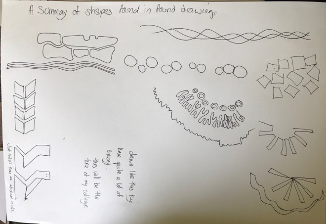


 Meandering
 Flowing


 I was underwhelmed by this body of work, I was a little bit stymied by finding a routine to use, I think that this just made the work a bit forced, deciding to use a cup of tea making was the best choice for me – perhaps it’s a bit more ritual than routine, however it still seemed like hoop a jumping exercise even though I managed to find some interesting shapes in the photos that are sketched . I could enlarge and abstract the images further to find elements to pursue further.
 Before committing to glue, I played with placement of the collage pieces, this felt very cluttered, the purse hat kind of suits me though. I thought it quite clever that My sharp eyes are a sharpener made of tiger – eye of the tiger! I enjoy word play. I have a Victorinox smile. A transforming multi tool, sharp and cutting, I can open bottles with my teeth ( not really – that’s artistic license)
 speech is key, a key to open doors, to be understood you need to talk…..
 Bonkers!!! This clearly shows the importance of careful placement, I moved swiftly onto crazy head dress/hair

 while making the larger iteration of the owl – the universal /ancestral owl I cut a shape from a wolf image, I noticed that serendipitously fitted my face, I became wolf girl!what a fierce transformation. I think it looks quite complete as a simple collage of two shapes.e


 I love that a pen knife (it is a tiny 40mm) that transforms can be transformed to wolf or human or owl depending on the rotation.
 in my sketch book I wrote a little about owls and ancestry. A relative used to raise birds of prey for wildlife parks and I got to hand feed them so there is another link there. Making multiples of owls of varying sizes to show a succession of ovum’s passed through the generations was the line of thought here. I was so absorbed by this process I think I got a little mad!


