Researching the work of Lucy Freeman I found an artist statement on artsthread.com
‘Portfolio Lucy Freeman
Summer 2016 Collection ‘Wish I was there’
‘Wish I was there’ is an interiors collection exploring escapism and child-like optimism, creating bold, vibrant imagery evocative of tropical holiday destinations, but in surreal dreamlike compositions, creating only an abstract, unattainable visualisation of a joyful and playful place we dream to escape to.’
This statement could be a basis for the way I decided to approach this final task.
But , without the tropical holidays, think more verdant fairly rocky geological wonderland with layers of history, quietly crumbling beneath the surface…..
I think that my printer tends to tone down colours as the photos I printed out aren’t as vibrant as on the iPad, however my found drawings tended towards neutrals with lots of greys and browns. I used a colour identifying app on a couple of the photos to see if I could pick out key colours and got more neutrals than the colour pops that had drawn my eye, as they formed the largest proportion of the images. I wanted to work with some more vibrant shades so picked two photos to work from,

 a natural lichen and a distressed man made surface. Within ares of the photos it’s difficult to observe a specific colour because of shadows and highlights.
I observed that the same grey was very noticeable in both photos.
I referred to a colour mixing exercise from ATV to match the colours , a really pleasing process and I was very happy with accuracy.
Looking for these shapes and feeling in the frottage and found drawings collection. I drew some bold forms based on all the found drawing pictures.
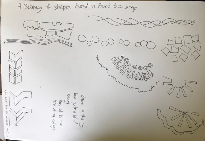
From this I cut a number of elements and arranged them loosely in different configurations on different backgrounds.


I also printed these out in monotone , the grey background almost swallowed up the collage pieces as the colours were tonally similar. I felt the white background worked reasonably well, the colours appear very pastel , against the black background they are more vibrant.


Final iteration on A2 black card, the top image is quiet and calm.
With additional colour pop of red circles the energy is completely changed, the image is much more dynamic.
Does it answer what is being asked of you?
This piece responds strongly to the brief. The process, followed systematically worked well for me in this project.
how can you develop your ideas ?
I could work with colour selection, although I carefully matched colours to my found drawings, the resulting palate is a little whimsical and not particularly sophisticated, probably not a combination I would have instinctively work with. Obviously colour choice depends on purpose. This piece is quite strongly commercial I think, it’s quite Scandinavian I would like to think Marimeko but perhaps more IKEA!
how can you revisit the work to improve
I was careful to experiment with placement of individual motifs, and relied on gut feeling, I would like to develop a better understanding of the language of composition.