Considering the selection of a piece of work from part Three to experiment with placement in varied locations.
While making work I have not considered where the ideal location is for it to be placed. In MMT after I had made pieces I did find it clear to myself that they should be photographed on the sea shore or on a rocky crag as I felt the added context was important. I’m wondering now about how a piece of work should perhaps have a strong enough narrative to stand alone .
Considering exhibitions, choice of colour, lighting, relative placement to other works is clearly made; for example when Grayson Perry hung the Summer Exhibition there was an excellent documentary interview of the choices of gallery wall colour etc. I watched a video of Tracey Emin talking about the effects of a gallery space on how her work is chosen and indeed made , for commissioned exhibitions.
Stage one – ideas/concept
Selection of a piece of my work is slightly stymied by my focus on exploring materials – it is really difficult to ‘ state what I initially wanted the (original) sample to do or say‘ . I was considering the idea of place in my choice of colour and materials and made some visual reference to drawings of texture and shapes and marks. Was I necessarily saying anything?
Further unorthodox placing
The piece sits really well in the landscape, the curve of the hills and rock forms and iron in the rocks, reflect the form of the weaving.
The industrial revolution starts here and is woven into the story of the place.
a quote ‘all sculpture takes its bearings from the fact that we live inside our bodies and that our size and stretch and strength is what it is’ (quoted in Moorhouse, p.25). I haven’t previously considered the physical realationship of the work I make to myself, my size my strength, apart from references to the resilience of the material or physical difficulty of a process so this is another point of context to consider when making. Part of Identity.
I admire the inventiveness of creating the little foot – almost invisible that alongside the overhanging structure dictates how the piece stands to be observed – very ingenious. I recognise that this is a trait I take into consideration alongside narrative and visual qualities of work.
Using colour to create visual unity – I have felt visual unity when looking at his sculptures elsewhere but hadn’t realised this ‘technique ‘of using colour to unify – seems obvious now it is explained!
Contexts for textiles- I have mind mapped some ideas of textiles use, both obvious and perhaps slightly overlooked with broad categories including clothing, protection, communication, barriers, interiors, storage, sports, medical, construction, leisure. I will illustrate with photos as I observe particularly interesting applications.
Yarn bombing
Is perhaps a way of creating visual unity by enclosing an object in colour. Its certainly a way of drawing attention when used on specific statues for example. Statues often just become part of the scenery and yarn bombing is sometimes used to draw attention back to an heroic or political cause.
Yarn bombing is part of a wider Guirilla art movement people taking upon themselves to add visual improvements to their neighbourhoods.
Gardening, planting wild flowers, trees, vegetables for the benefit of locals and the environment.
Graffiti – not mindless tags but beautiful artworks often with a political or social message.
Yarn bombing – lots of images on Pinterest of imaginative and amusing installations. Site specific, sometimes event specific. Individual or community installations
Ann Eunson for example has knitted a lace pattern fence around her garden using a traditional Shetland design. This I love for its delicacy and tenacity. Art in unusual places always sparks a though stream, maybe because it takes you unawares during a time of contemplation.
An interesting article in the Guardian titled A stitch in time: how craftivists found their radical voice with examples of collectives of people using textiles as campaign tool – to convince M&S to pay a living wage and protect migrating birds from dredging nets.
Historically textiles have been used as communication, the Bayeaux tapestry, union banners etc Perhaps this craftivism is enabled through the resurgence of craft hobbies, people turning to making as a meditative response to dissatisfaction with happenings in the wider world , naturally using comfortable techniques to have a voice. Subtle and subversive.
Tied in as well to collective happenings like Migration blanket in Birmingham or Alice Kettles Stitch a tree project. the fine art world
I think that the political edge has strongly embedded craft in today’s zeitgeist, the air of cool has completely blown away associations with the fusty or old fashioned notions and granted permission to create with soft materials. Edgier magazines to mainstream newspapers like an interesting inch of column space to break up the tedium of daily news. Craftivism fits the bill nicely.
Really interesting read . Strange Materials, by Leanne Prain. Chapter 4 Textiles of Protest, politics and power.
Fabric manipulation based on words – I had a much stronger response to this than drawings based on words, I am currently much more inquisitive with playing with fabrics and working in 3D.
Knitting and crochet – unconventional tools
Arm knitting was a reflective, mind full process . I enjoyed the rhythm, the comfort of becoming enveloped in luxurious yarn and the scale. It didn’t seem a productive or useful process otherwise – just clumsy. I would be more than happy to make tools to solve a problem of working with a material . But using them gratuitously seemed egotistical (like knitting with diggers) Doing it for a dare, or just for the sake of it is not my mindset.
Knitting and crochet – unconventional materials.
Any material is up for grabs if it suits a purpose. I naturally eye up skips for example for possible resources, often use found materials ,and often like Rauschenberg will use them as a starting point for a piece of work.
I’m more than happy to experiment, however this exercise reinforced ny dislike of packaging plastics, it’s almost becoming an aversion, it seems chemically and politically tainted. Taking it out of the waste stream could be a positive but I don’t like the texture or visual appearance much. I enjoyed the resilience and linear quality of the telephone wire though and its communication context.
Weaving
Oh my word! I don’t remember ever weaving anything. I could really immerse myself in this process, I had a similar response to wrapping in MMT . It is totally immersive. I had forgotten that space that I go to when transfixed and focussed on a creative task. Pure contentment. And so needed. I hadn’t realised how little time I’ve had for making for months now.
Self assessment:
Demonstration of technical and visual skills: Materials, techniques, observational skills, visual awareness, design and compositional skills.
My strength here was certainly weaving, my samples have clear links to the drawings and mark making from parts onset and two, I have investigated techniques using a range of materials and noted further investigations I have realised the role of sampling in developing ideas further by using drawings and reflection of successful and more importantly less successful samples.
Quality of outcome: Content, application of knowledge, presentation of work in a coherent manner, discernment, conceptualisation of thoughts and communication of ideas.
despite the disaster of my failing of my technology
This happened I learnt a lot from artist research in ex 3.1. Particularly from watching video interviews of Polly Binns and Tracey Emin.
Demonstration of creativity: Imagination, experimentation, invention, development of a personal voice – I’m happiest when experimenting and can be inventive with materials, for this assignment I did feel more informed by my research and was able to be less literal with interpretation of my drawings , when making samples that I feel , had a strong sense of place while also working with a colour palate developed from exploring future trends.
Context: Reflection, research and critical thinking.
Again I have reflected more than communication my ideas, however I am developing strategies to remedy this.
Strata- cut, stitched, recut. Pieced together. Considering the action of time on place. I’m living an area of geological wealth- I believe the landscape around me contains over 90% of rocks found in the UK . A treasure ground for a pebble gatherer such as myself. I’m as yet undecided which side I prefer, im leaning slightly towards the side with unfinished edges as it alludes more to timeworn rock surfaces.j
I crocheted
the like lichen centres whilst walking in the countryside. I hadn’t realised how desperately I needed to be out and about in nature. I thought about the way that Barbara Hepworth and Polly Binns
Relate to landscape, the act of crochet was an act of marking steps, a form of communication with the place, a measure of being – like a hour glass. I joined the pieces at home, crocheting with silk like a Louise Bourgeois spider, i had in my mind a remembrance of Womb Room, a crocheted environment by Faith Wildling, I know little about her work apart from she was key part of the feminist art movement in the 70’s- very high on my list of artists to research further.
I thought to join the circles using a disorderly , lacy mesh-like lichen on rock. I realise that a larger hook would have given a more spacious effect,
This was the first constructed cloth, I thought that layering may give that soft definition between lichen and rock. The transition between things is and interesting place, day – night, hill-mountain, beach -sea . The piece looks very clumsy and unrefined. I tried to cut some layers in a reverse appliqué fashion, so had included different transparencies of fabric, it may work in other iterations, perhaps a much larger scale would help,
Fraying , and unfinished edges are pleasing though.
60cm of telephone cable, split half way and the inner wires woven into a bug. Telephone is bugged? The way bees communicate is incredible, we could do it better even with all our technology we fail. Insects are undeniably part of place, they are part of the circle of make and maintain.
Willow twigs and wool, and deep contemplation.
I think that this wooden strip is for edging birch ply to make it look solid. It was gleaned from my local scrap store. As a continuous strip used as a warp, it formed an awkward cylinder, by overlapping the strip at the join and merging the weft it forms an elegant almost basket. Using an ombré yarn has produced a very pleasing colour transition, I’m particularly pleased with this piece. I feel that it has a gravitas whereas some of the other experiments seem very forced and gratuitous.
I need to find a source for more of the strip but could play with creating more forms based on exploring this technique endlessly perhaps. I am put a little in mind of some works I saw in Turner Contemporary gallery by Eva Hesse.
A dumped couch was disassembled to rescue a spring warp, simply woven with a cotton weft. I was tempted to wet it and encourage rust emphasising the discarded element. This would perhaps feel too much borrowed from Alice Fox who works extensively with rust in her work. I do like rust though, I enjoy the richness of iron stains on rock faces and river pebbles.
Packaging plastic mesh from a carpet shop, with a binding tape weft. I’m really liking weaving- even simple materials seem elevated into elegance. An d the process is so engaging. I have been feeling very stressed and the weaving process is so therapeutic. In and out , round and round. Like time ticking, earth turning, it is present moment and strongly linked to the past.
Gathering. I used a food produce bag to gather things from nature. A foraging . Fragility of nature. A nod to plastic waste polluting the countryside. Some interesting metaphors to be found here.
using willow twigs as a warp and willowish tones from my theme as a weft. It may be interesting to use measured lengths of weft according to distance or time walking trails. I could look for proportions of colour in a landscape and use in colour block. The elegance of willow branches is well represented in this linear form. I could also soak in water for a day and this would make the willow flexible enough to bend into a circular form – with the opposite ends woven together..
I watched the video of Dave Cole knotting with the aid of diggers with very mixed feelings. First thoughts ‘knitting with man tools?what a gimmick. Would I have been happier with women in the diggers – I think perhaps not. I’m not a fan of gimmicky techniques to look at. Perhaps experiencing unusual tools with give me further insight into this .
Knit/crochet with unusual materials.
telephone wire and the cellophane that wrapped itin it’s black plastic casing – a handy tool to use later!
Crochet, very large hook. Incredibly thick felted yarn (not spun ) with incredibly thin industrial waste thread – I was thinking water splashing and listened to Kingfisher by Kris Drever. I will try felting this to flatten the knots and accentuate the holes.
Knitting with unconventional tools
Arm knitting. I have made a scarf essentially! Learnt things though.
I find such contemplative tasks soothing. There was a great sense of connecting with materials. Contemplated measuring. Time 1hr, loop size equivalent to my wrist – no one else’s..
Knitting a plastic bottle
P.E.T – fabric
Crochet with mod rock – far easier to crochet and then dip in plaster, a messy process has created a bone like structure- unintentional but often sheep bones are found on the Long Mynd and other hill areas- bones of the landscape…
Large scale knitting – plastic waste
I’m trying to source a bike tyre to use with bin liners to make a dream catcher – much hay bail covering ends up shredded in the hedgerows.
Based on that thought I made this hoop of broken dreams from a hula hoop and ripped leggings. It has a very different feel from the idea of the discarded farm waste. I find the narrative behind materials really interesting.
Crochet fence panel – washing line
Clearly not a fence panel! Like the plastic bottle this washing line is very springy and difficult to work with. Without taking it further this brings up the interesting considerations – when to stop a sample, how much do I need to learn from a process – is completion necessary? It feels that this assignment is about experimenting with materials rather than making complete products. In this case then the material has shown to be difficult to work with, adds to my dislike of unnatural materials and has taught me is properties. When I need a flexible resilient material I will know where to go!
hula hoop of broken dreams. Hula hooping ,referencing that energy and optimism of youthful festivaling, knotted with ripped and discarded leggings. This is a place in time rather than the original concept – I wanted to use black bin liners with a bicycle tyre, as a sad reflection of the amount of plastic from hay bale wrapping that around roadside fences – inevitably making its way towards the oceans.it would look similar however the material choice defines the context.
comparing the same technique, finger knitting with very different materials. Soft fluid silk, and hard crispy plastic. Both have a soft visual sheen and quite an energetic appearance. a very different drape.
Experimenting with unconventional materials and tools, my brain slid laterally into this combination of a tangled fishing line with knitting tools.
Nothing need be conventional. It felt quite forced , a little gratuitous using unconventional tools for the sake of using them. However I have learned that experience is far mor valuable that merely considering techniques or tools. The process of making, its repetition and time spent in that meditative state is where thought expands and ideas and understanding happen. Each decision made during the making process , from stitch to stitch, which way to wind a yarn around the twig etc is feeding into the mind bank of creativity.
Knitting – drift wood and river stick – river to the sea
Gathering. I kept the proportions of fabric and stitch size the same so there was a clear comparison between fabrics ranging from thick vintage linen to almost transparent manufactured fabric .
The translucency of this is fascinating, water-like yet also captures the etherial quality of the reflected light photos in found drawings.
In comparison this cotton weave sample is quite lifeless.
A stack of samples to build up. The volume.
I love the undulating lines of the side view of the vintage linen.
experimenting with parallel gathers, asymmetric, and sine wave, the asymmetric sample folds into a 3 sided pyramid, this may have scope for further investigation. I have a fascination with 3D forms.
Folding
Pleated fan, simple and obvious ,however the cotton organdie holds such a sharp crease , the motif folding heavy linen with the transparent fabric creates a meandering rhythmic form
This form actually was inspired by a fortune cookie. I saw in the shape the curved marks from the lichen drawings, the fennel seeds in my tea, I enjoyed the process of folding and curving the fabric. I find the transition from flat disc to curved 3D form fascination, a germination.
Layers
Organdie and transparent layers with a like tension inserted which stitches to encourage the layers apart.very effective shadows, this piece works better standing so that the light can pass through it.
Layering the dots from the first piece, I would have preferred to use invisible thread, this is a very light and airy piece – or perhaps soft and bubbling like a crisp cool stream tumbling down a rocky valley. The combination of fabrics works well, the composition is suitably un uniform, it has flexibility to be flat or more 3D
Rolling
Stretch fabric stretched forms a roll. Folded and stitched like rock styrations. Heavy – I guess this is suitable. I could experiment with lighter fabrics to compare, it is very representational but does not say much to me. Lacking narrative when in fact those buckled layers have immense history.
cut and rolled, this is incredibly delicate, like a spider leg hair under a microscope, I may be a bit fascinated by this fabric. The sample is simple in essence but quite lovely. I often have expectations that a sample needs to be complex, however it’s what is left out sometimes that makes ab effective piece.
Tolling- varying sizes of ripstop nylon- like foaming water
Crumple
organdie folded and cut, crumpled to crinkle , lichen like.
This makes a fantastic crinkle noise when crumpled. Laminated plastic and mesh (ironed)
cut and distorted
Cut and restitched
Both rock like, textural cliff face
knots work to create texture and shadows, adjust effects by experimenting with fabric and tightness of knot.
Macrame with ripped cotton makes nice hole shapesknotted farmers binding twine- often tangled in hedgerows individual strands joined to wire circle – a complete circle would be nice- I need to find more discarded string- this is a dilemma as I would rather not find string littering the countryside.
I enjoyed looking at the work of Rowan Mersh and appreciate his intuitive use of materials, also his seeming simple and muted colour palette which gives the beautiful intricate textures your complete focus, his works are complex structural surfaces with a sense of harmony, I’d love to invert then close up.
This little fan element – which hearkens to the ginkgo frottage were perfect to experiment with the scale, in terms of material the organdie is perfect as a sculptural material as it holds a sharp crease. The half size sample is a success but terribly fiddley to make, the twice size not quite as sharp , so less charming.
I chose a simple curved mark to make multiples. This unit uses tension created by creasing and stretching a stiff cotton interfacing circle. I created several successful iterations.
I’m sure that the Pantone app used to enable you ton select parts of a photo to colour match but it is no longer useful in that it chooses by volume of colour. Real colours app is slightly better , but for example I would have liked to choose the green from the bottom photo and was unable to. If I w going to use it more I would invest in photo shop , I’m sure there must be a technological application that I haven’t found yet.
I matched theses colours using a pixel choosing tool in Procreate, it was a faff and there must be a better way.
Through my research , particularly the video conversation with Polly Binns, I have realised that place and personal experience are so interlink as to be the same theme for me. My connection to place is stronger than other connections. Landscape feeds my mind and emotional self.
My Theme boards. From ancient hills to rugged coast. These are the places where my heart sings.
Neo mint evident in the sea and lichen. Barbara Hepworth walked the land here, verdigris in weathered bronze and ancient rocks in shades of grey. Muted orange brown picked in the rocks adds warmth to balance the cool blues. Earth tones .
Picking another strong trend of mellow yellows, late afternoon sun on the hillside and creeping lichen. Deep blue sky, granite of the standing stone. Heartening back to simpler times. I’ve included a turmeric print silk and colourgraph print of nettle. Colour from nature.
In Part Three you’ll start by using critical reflection skills to review your work so far. This process will lead you to identify a theme which you’ll use as the basis for your exploration of some different and perhaps new ways of working with textiles. You’ll create a varied range of experimental fabric samples, which you’ll have the opportunity to refine in Part Five. You’ll extend your knowledge of the work of other contemporary artists and designers through focused research into their ideas and working practices as well as continuing to carry out independent research, which you should evidence in your learning log.
As an example look at Manet’s Le Déjeuner sur l’herbe, then at Picasso’s body of works based upon this, from paintings to sculptures.
Research the following artists:
• Polly Binns
https://youtu.be/VakrWlKh5F8 this interview with Polly Binns and Anne Morrell at the time of their joint exhibition. At Nottingham castle in 2013.
Uses stitch as structure and mark making components in her work. Observes light and texture in the landscape.
ttt
Serial Shimmers and Shades(detail) 1996, acrylic paint and thread on linen 185x125cm .
sparse, clean , airy, minimal
• Tracey Emin
• Hew Locke
ark 1994 papier-mâché, wood, steel, mixed media 4.57×3.35×1.83m
I love the scale of this, it’s the sort of thing I built from cereal boxes as a child – but huge, fantastical, escapist.
Field note is a collaboration with composer Howard Skempton. I appreciate the colour palate, the never boundary reminds me of how as people we don’t have defined boundaries but overlap with others in different ways
Motifs, lines, dots – rhythmic
• Michael Brennand- Wood
• Louise Bourgeois.
For each one, select four images that inspire or challenge you and put these in your learning log together with a short sentence explaining why you have chosen them. You may not like their work at all; if this is the case, try to explain why.
Do any of the works you’ve chosen share any of the themes from Parts One and Two? Are there any themes in the artist’s work that you share? Which works do you find most inspiring and most challenging? Record your findings in your learning log.
Now try to find out about the artists’ working methods. How do they ‘make’? How do they develop their ideas? Is it through drawing or some other means? Write around 200 words for each artist in your learning log.
Finally, select an artist who inspires you and who you feel is similar to your way of thinking and creating. This doesn’t have to be one of the artists listed above. Think about what impact this artist has upon you and your work. How might they influence your work in future? Write up your findings as a 500-word reflection with images in your learning log.
where has it gone ?
I’m so depressed it’s taken 2 days to do this and the content has disappeared, it was a real struggle and now it’s gone , there’s no time to do it again.
Trend forecasting – a wealth of information about trend forecasting is available, however colour trend information is a commodity that fashion and interior design companies pay for. It seems to be a huge self driven industry.Trend forecasting is at the forefront of driving the ever quickening fashion season. Creating a demand for new stuff.
At the cutting edge artists, musicians, travellers and probably the Instagram ‘influencers ‘ are where trend forecasters find fresh ideas.
Looking back at the history of Pantone colour of the year colour trend also seem quite cyclic. The hot trends are obviously going to have to be part of a colour group.
https://www.dezeen.com/2018/05/11/neo-mint-colour-2020-wgsn-trends-design/. Following a trail of focussed search terms I found this palate on the Dezeen website that seems to summarise my findings elsewhere. Obviously there is a trickle down effect from couture fashion down to high street chain stores , and also through cutting edge niche magazines through to newspaper supplements. I had a flick through Elle decoration and Bazaar (cheap twin pack- I don’t generally indulge!) and indeed these are the colours that are being pushed to the consumers of fashionable stuff. Changes in fashion keep the economy turning.
Before you embark on any practical work, write a critical self-appraisal of the work you submitted for Parts One and Two. You submitted a reflective account as part of Assignment Two but you now you have the opportunity to review Parts One and Two in response to your tutor’s feedback and to reflect upon the outcomes as a whole. You’ll also use the appraisal to help you identify what you feel were the strongest themes that emerged for you in Part One.
My responsive mark making is becoming more free, I created a range of subtle and sensitive marks relating to photos of place. My photos of found marks were very successful – feedback comments were positive. I can use my observational and composition skills moving forward to develop my work.
I identified elements in my drawings, experimented with iterations and the final outcome collage was successful in its composition and use of colour, I particularly feel that the frottaged elements of old lace that were cut and placed play a good homage to the age and texture of lichens that other elements were abstracted from. I keep coming back to this relationship/contrast between old and contemporary, for example in the piece relating to place in assignment one.
Stitched words relating to place resulted in a visually interesting surface, that was successfully frottaged. This way of embedding words in an abstract way is of great interest and something to develop further – combined with the idea of responding to words/feelings visually in the found drawings exercise perhaps.
My collage relating to the work of Marcelo Montreal is one of my strongest pieces. It works well visually however I feel that the success is more to do with the visual metaphors, looking at the image again I see a split between ancestral inherited traits/emotional baggage and self moving forward. Perceived and self awareness, there’s actually a lot of potentially powerful stuff to explore here….
Drawing does not need to be complicated. I’ve just removed my waffling justification . This is just a simple yet important learning. Don’t over complicate.
This collage may be clumsy however , I am interested in the layering and overlaying of landscape, archaeological layers, humanity vs nature, here I like the translucence of the trees and the bedrock of words. Strata is the concept that I could take from this sketch. My understanding of part one and two is that we were not to create completed works but to experiment with ideas . Some of the idea generating was painful, the hindsight that it gives is the important learning to take away here. Already with only a short period of reflection I can see how neural pathways are being formed. When I made this collage a very few weeks ago it seemed like hoop jumping, the reflective process is powerful. I am learning that I must just do stuff that can be reflected upon to find the juiciness.
I find monoprints give a really interesting surface, a fragility of line that is atmospheric and evocative – more so than drawing the same in pencil for example.
I am excited by this drawing of place described by capturing the paths of birds in my back garden. It has a great energy from the dynamism of the marks.
This representation of a journey is unresolved and I didn’t fully explain the concept of the branch from the place representing the route that I took. With the addition of the extension loop it is the same shape as the route on the os map. The route is way marked with totem poles, banded with colours for different walks, the stick is wrapped in bands of colour representing the ordered houses at the beginning, The Tudor period and then slowly becomes less uniform following the stream up the valley and back in time. The dyed cloth represents the valley in a more abstract way. My sketch book explains the feeling of peace the higher up the valley I climbed. The cloth will be grid like and dark like an OS map slowly loosing its formation and becoming lighter, airier and free.
work inspired by research into artists that cross boundaries . I produced this work very much based on place, using found materials.
This task is your opportunity to demonstrate, in a piece of succinct and focused writing,
both your learning and your self-awareness of your achievements. Ordering your thoughts in a structured way will help you start to develop a personal language that can sit alongside your practical work. This will enhance the writing in your learning log and build through the following projects to prepare you for writing your critical essay in Part Four. In your critical self-appraisal, as well as general comments upon your performance, ask yourself some specific questions:
• Which of the themes extracted from the de Waal article had the most personal resonance for you, and why?
I feel that in part one And two the works based on place were where I felt most comfortable, even gravitating naturally towards place in the first task. Reflecting back to MMT this is a theme that I kept returning to. I am fed by landscape.
• Was this also the theme that produced the best outcomes?
I certainly feel that these were the most engaging outcomes, although I had fun with the exercise with words in part one and my last outcomes working with text in part two were also pleasing. My most exciting piece was mapping bird flight in the garden, clearly place related and the concept I would like to take further.
• Which body of work stretched you most in terms of thinking?
I was flummoxed responding to music. I found Parts one and two quite frustrating. On reflection I can understand how elements will be invaluable moving forward however in places it felt like those times as a small child when you were asked for an impromptu performance of something, awkward and (that word that means you feel turned to stone) for example, work in response to music – in my research for 3.1 I found that Micheal Brennand-Wood chooses a sound track for the day to work to and be inspired by. This is what I often naturally do, I have a huge collection of widely different musical genres that I choose to suit my mood or task, how ever in the context of the task it felt forced, and atrophied my mind. I have often noted sounds as I walk and gather , I expect now I will note these things more. In terms of an exercise though, my work was severely lacking, my reflective outcome is richer and more useful.
• Which body of work stretched you most in terms of making?
I was most stretched working out how to respond to a personal routine, I not done much manipulating of photos before, I was reasonably successful with this task.
• Which body of work did you enjoy creating the most?
I would be torn here between the Work based on identity and labels collage work in part 2, boundary crossing piece in part one and the works based on place- particularly the bird piece and wrapped twig.
Finally, select one of the themes from Part One for further development in Project 4, together with what you feel were the key pieces of visual research from Part Two. Explain your reasons for these choices.
My reflections on artist research, point me to an investigation of my place in the landscape – I wouldn’t be able to clearly define where we separate, my being is spun from tiny everyday connections to my environment. identity is place, investigating where I am now compared to where I’m from – both physically and ancestoraly . My key pieces of visual research will be the found drawings and frottage combined with further investigation of mapping. I’m interested in the interview with Polly Binns her work is site specific but is more about her response to the Norfolk coast, than of the coast, this is similar to Jessica Warboys work with the sea and also of Barbara Hepworth walking of the landscape, their investigations of materials are fed by place but not dictated by it.
Demonstration of technical and visual skills, quality of outcome, demonstration of creativity –
You did well to produce this body of work in a short time. You have approached each exercise with thought and tried iterations of ideas. There could however be further investigation in the exercises , the body of work feels a little bit light but i am sure this is due to a lack of time and not a lack of ideas.
It might be that you should separate out some of your more resolved or successful pieces and mount simply on cartridge for assessment. For example your self portrait, the rubbing of your letter, the rubbing of the leaves in your environment. I shall confirm from Sandra if this is a good idea.
You experimented well with a variety of materials and processes. You handled line well in the initial drawing exercise. You produced a strong graphic composition.
The photos of the found marks were very successful. You observed very interesting textures, colours and compositions in these images. Think about how you instinctively did this with the camera frame and how this could be applied to samples you are creating.
The end of the sketchbook felt a bit rushed and scrappy. Please make sure papers are either in the book attached, out in a separate book or just placed in a simple fold of clean white paper acting as a sleeve. For assessment put details of the exercise neatly on the corner of the sleeve.
You presented your work well on your blog. It would however be helpful to have a paragraph of reflection after each exercise. ( you started to do this in the last couple of exercises)
Please give more detail in your reflection for example you say that you were underwhelmed by a certain assignment, explain why you think this is.
You mentioned Tracy Emin and Elise Englar were important artists for you in this assignment, please explain why. What did you connect with in their work? Do you feel that your work was a response to this, if yes why, if not then why not ?
Please include the rest of the research artist analysis in the final assessment.
Well done, I look forward to your next assignment.
In Part Two you’ve produced a body of written and visual research and drawing exploring the themes identified in Part One. You should now conclude your work by reflecting on what you’ve learnt in Parts One and Two. Write about the development of both your research and creative skills, and identify what you think you’ve learnt from undertaking these exercises. Discuss how research has broadened your understanding of the creative process, and how exploring a range of different creative approaches to drawing and mark-making can help you to generate ideas
in response to a theme. Highlight areas of strength and any areas that you think require further development. You should aim to write approximately 500 words, and include this in your learning log.
This was a tricky journey that I have taken very quickly. merely dipping my toes into a range of processes and concepts for generating ideas has whetted my appetite for researching ways of developing thought processes.
I was particularly struck by the Martin Creed video
The main thing I have learnt is not to pre judge. The process of immersion in a task , being inquisitive, questioning and ready to experiment can yield results I couldn’t dream of – dreaming up ideas is a bit of a fallacy perhaps! It is a skill that can be honed,
I have quite a good understanding of critical reflection , my research for this assignment is not complete, currently a collection af annotated images and rough notes from many open tabs on my computer. I did not approach the research systematically but all at once and it blew my mind, brain fog, my short term memory just couldn’t cope I need to develop a strategy to cope with this. Currently I’m Using Microsoft notes as a swipe file to gather information, make notes and gather images but collation is proving complicated. It Is my priority for moving forward. It is clear that the research I have managed has been key to unlocking concepts and revelations so not committing enough focus to this will be a barrier to fully realising my progress.
My creative journey falls between , Tracey Emin strongly expressive of personal journey, highly emotional. Vs documentary/archaeological approach of Elise Engler.
After really enjoying MMT I felt very materials and process led but now see that the ideas and process led approaches have generated thought processes in ways I haven’t really considered. The pieces of work using collage resonated more , I guess this was more to do with manipulation of materials, also very colour and composition based. Words weren’t for me but actually the frottaged stitch sample was a favourite piece due the interesting surface texture, I wish I’d frottaged in white on a light background to further investigate the the shapes found.
Researching the work of Lucy Freeman I found an artist statement on artsthread.com
‘Portfolio Lucy Freeman
Summer 2016 Collection ‘Wish I was there’
‘Wish I was there’ is an interiors collection exploring escapism and child-like optimism, creating bold, vibrant imagery evocative of tropical holiday destinations, but in surreal dreamlike compositions, creating only an abstract, unattainable visualisation of a joyful and playful place we dream to escape to.’
This statement could be a basis for the way I decided to approach this final task.
But , without the tropical holidays, think more verdant fairly rocky geological wonderland with layers of history, quietly crumbling beneath the surface…..
I think that my printer tends to tone down colours as the photos I printed out aren’t as vibrant as on the iPad, however my found drawings tended towards neutrals with lots of greys and browns. I used a colour identifying app on a couple of the photos to see if I could pick out key colours and got more neutrals than the colour pops that had drawn my eye, as they formed the largest proportion of the images. I wanted to work with some more vibrant shades so picked two photos to work from,
a natural lichen and a distressed man made surface. Within ares of the photos it’s difficult to observe a specific colour because of shadows and highlights.
I observed that the same grey was very noticeable in both photos.
I referred to a colour mixing exercise from ATV to match the colours , a really pleasing process and I was very happy with accuracy.
Looking for these shapes and feeling in the frottage and found drawings collection. I drew some bold forms based on all the found drawing pictures.
From this I cut a number of elements and arranged them loosely in different configurations on different backgrounds.
I also printed these out in monotone , the grey background almost swallowed up the collage pieces as the colours were tonally similar. I felt the white background worked reasonably well, the colours appear very pastel , against the black background they are more vibrant.
Final iteration on A2 black card, the top image is quiet and calm.
With additional colour pop of red circles the energy is completely changed, the image is much more dynamic.
Does it answer what is being asked of you?
This piece responds strongly to the brief. The process, followed systematically worked well for me in this project.
how can you develop your ideas ?
I could work with colour selection, although I carefully matched colours to my found drawings, the resulting palate is a little whimsical and not particularly sophisticated, probably not a combination I would have instinctively work with. Obviously colour choice depends on purpose. This piece is quite strongly commercial I think, it’s quite Scandinavian I would like to think Marimeko but perhaps more IKEA!
how can you revisit the work to improve
I was careful to experiment with placement of individual motifs, and relied on gut feeling, I would like to develop a better understanding of the language of composition.
This assignment feels very much like working backwards. I’m very much an observer of my environment, the minutiae more so than the mighty. I got completely engrossed in gathering photos of found drawings. My first edit got them down to 93. I hesitated to make a quicker decision to narrow down to 10 as I couldn’t really understand the process I was supposed to be going through.
I printed out 16 photos at a more observable size “to use them as a basis of drawings and image development.”
I unravelled at what using adjectives to describe physical (this is fine) and emotional characteristics means? I had to find some words to use to steer away from being repetitive. In my sketch book I observed the similarities or groupings in the chosen images. Had I pre planned I would probably have taken different images –
Another way to approach this would be to choose emotional/physical words and go in search of images that fulfill the description.
This felt like cheating somehow ( I’m still very much stuck in the rut of taking the course notes too literally.
One by one I selected images that I could choose adjectives for, I made some very quick marks and drawings and found that this process of choosing media and drawing what I saw actually inspired more words to respond to. Ha! Result.
Dappled
Bumpy, encrusted
Meandering
radial, radiatingFlowing
Having identified many words… I intend to respond to a variety rather than all at this time. However I feel that this process can become part of my independent sketch book work as I’m clearly seeing the value in this approach. The process of seeing an interesting shape is a starting point, attaching emotional/descriptive words demands more inquiry, mark making in response to deeper enquiry is the start of a dialogue.
Perhaps I should be less anxious about the course notes. These exercises are a starting point and will inevitably lead each of us on a slightly different journey, there may be no right or wrong. Splendid.
Elements to consider-
1) surface texture
2) pattern and shape
3) colour
Does it answer what is being asked of you?
I have responded to the brief by observing my environment and photographing found drawings. I have observed the emotional/descriptive qualities and responded with mark making.
how can you develop your ideas ?
Continuing to develop skills of forming a dialogue , understanding the narrative that is formed from my personal response, investigating that response with material investigation and experimentation.
What are you trying to achieve in your samples/ art ?
This is very profound!!! – the answer to life itself? Self understanding?probably acceptance?
have you achieved it? if not why?
I’m obviously still searching for what I’m trying to achieve, I’m working towards finding a personal voice. I’m very much in toddlerhood, riding the creative wave looking for answers. My understanding is that achieving a goal is possibly not the goal I’m searching for…. ever learning and looking is the creative process.
how can you revisit the work to improve
Practice. I think that improvement may not be cyclic , more spiralling application of learning to future works, working with a theme is a strong pattern for artists in art movements through history, Monets’ Lilly ponds for example.
A photocopier has a very personal sound, they are all so different!! I have honestly been compelled to dance to rhythm of a large school copier- perhaps choreography would be an interesting way to record sound?
I found too many parts to the noise to make individual marks and the resulting up and down lines are just the same as noise/time graphs. I found making rows of marks broke my concentration so cut lengths of paper from a roll to make continuous drawings.
I stalked a chainsaw, a sad sound, the death of a tree. It seemed less regular than I would expect, just being held still was a steady sound, engaged with the wood not so steady and obviously the starting and stopping were different again, a very linear story and I was compelled to record it in a linear fashion, first with a very broad marker – harsh and precise and then a graphite stick , softer and closer to nature.
An attempt to record more accurately I used oilpastel , drafting film has a smooth surface so the oil would smudge, a lovely quality to this line, combined with colour, fresh blue, I think more representative of boiling water. Still very graph like.
We are all machines, if not mechanical. Whilst listening out for machine noises I found nature sounds creeping into my awareness. I videoed an overflowing stream observing the repeat splash of a branch being pulled down stream and springing back, perhaps the most regular sound I heard, and then other patterns of the stream started to punctuate, my mind would be drawn away for a while and then the branch would again intervene, a crow cawed…. a true symphony. The stream overflowed because of endless rain. I will revisit and contemplate how best to capture the feeling.
With closed eyes a waterfall sounded exactly like a steam engine (rather than a steam train) which made me wonder about how we engage all of our senses when we engage with an art work.
recording sound is very different to representing sound. If representing sound I could break away from a linear format .
Using a hammer and mark making tools.
Using more gestural marks
Using more dynamic marks.
This would be a more reflective than recording process.
I diligently got my mom and sister to write over the top of letters and photocopied and enlarged, rotated , overlapped by photocopying onto photocopied paper to arrive at a range of papers. I didn’t become excited by this process.
these manipulation s in an app called MegaPhoto are an excellent example of getting carried away!!!
I feel that there is a not so fine balance here of artistic intent and very clever technical wizardry that leads you down a path of distraction. I’m guessing that , if avoiding those dangers a spark of an idea could be created.
I imported one of the images that I had manipulated into the Procreate app and block coloured the background, then created a tiled pattern. Nothing spectacular, however I can see that with some experience there is scope for using digital manipulation as a useful tool. As I noted in the collage project there is also a danger of getting lost and carried away.
Cutting holes and reassembling , I haven’t investigated very thoroughly, for example the holes could be circular. Different sizes, random, I could weave , rip , shred – actually veryfine shred rearranged appeals- this is an example of the process of experimentation working!
I chose a section of the overwritten letter to explore further by stitching over the top onto a piece of cotton voile. The reverse of the stitched piece has much more textural interest than the electronic manipulation, the loose threads and dots of black thread pulled through to the back are much more interesting than pixels to me. Using frottage to rotate, offset and repeat in a different colour has given an interesting set of drawings.
I needed to soak the photocopy paper to remove sections, with thinner paper I could remove this more easily and achieve a wider selection of negative shapes, texturally this reminds me of the bark of a plane tree.
Reflecting on the creation of further letters, I had considered writing to my younger and older self, this ties in with links to ancestors in the collage project. Asking myself the question of who am I?- we are a sum of many parts. This collage is of me with the combined letter from my mother, my sister, myself.
I got more from this exercise than I expected as to be honest I just wasn’t inspired at all by the brief and went through the stages quite mechanically. There is some real strength in the stitched and frottaged piece and I certainly wouldn’t have got there without the earlier processes.
For me the textile related pieces are more interesting visually, they have more gravitas and feel more intentional. The graphic pieces have more of a feeling of accidental design, more contrived and less interesting.
some of the difficulty here was the personnel nature of using a letter, this felt too intimate and exposing of self. The ability to do this, is part of the success of many artists, Tracey Emin is a clear example of not holding anything back. Art can be cathartic in this way.


 Strata- cut, stitched, recut. Pieced together. Considering the action of time on place. I’m living an area of geological wealth- I believe the landscape around me contains over 90% of rocks found in the UK . A treasure ground for a pebble gatherer such as myself. I’m as yet undecided which side I prefer, im leaning slightly towards the side with unfinished edges as it alludes more to timeworn rock surfaces.
 j
j I crocheted


 using willow twigs as a warp and willowish tones from my theme as a weft. It may be interesting to use measured lengths of weft according to distance or time walking trails. I could look for proportions of colour in a landscape and use in colour block. The elegance of willow branches is well represented in this linear form. I could also soak in water for a day and this would make the willow flexible enough to bend into a circular form – with the opposite ends woven together..
 telephone wire and the cellophane that wrapped itin it’s black plastic casing – a handy tool to use later!


 hula hoop of broken dreams. Hula hooping ,referencing that energy and optimism of youthful festivaling, knotted with ripped and discarded leggings. This is a place in time rather than the original concept – I wanted to use black bin liners with a bicycle tyre, as a sad reflection of the amount of plastic from hay bale wrapping that around roadside fences – inevitably making its way towards the oceans.it would look similar however the material choice defines the context.

 comparing the same technique, finger knitting with very different materials. Soft fluid silk, and hard crispy plastic. Both have a soft visual sheen and quite an energetic appearance. a very different drape.


 experimenting with parallel gathers, asymmetric, and sine wave, the asymmetric sample folds into a 3 sided pyramid, this may have scope for further investigation. I have a fascination with 3D forms.

 folding heavy linen with the transparent fabric creates a meandering rhythmic form


 cut and rolled, this is incredibly delicate, like a spider leg hair under a microscope, I may be a bit fascinated by this fabric. The sample is simple in essence but quite lovely. I often have expectations that a sample needs to be complex, however it’s what is left out sometimes that makes ab effective piece.


 cut and distorted

 knots work to create texture and shadows, adjust effects by experimenting with fabric and tightness of knot.

 knotted farmers binding twine- often tangled in hedgerows individual strands joined to wire circle – a complete circle would be nice- I need to find more discarded string- this is a dilemma as I would rather not find string littering the countryside.


 I matched theses colours using a pixel choosing tool in Procreate, it was a faff and there must be a better way.


 ttt
ttt Serial Shimmers and Shades(detail) 1996, acrylic paint and thread on linen 185x125cm .


 https://store.pantone.com/uk/en/pantoneview-colour-planner-spring-summer-2020.html
 https://www.architecturaldigest.com/story/the-color-trends-well-be-seeing-in-2020-according-to-sherwin-williams


 a natural lichen and a distressed man made surface. Within ares of the photos it’s difficult to observe a specific colour because of shadows and highlights.
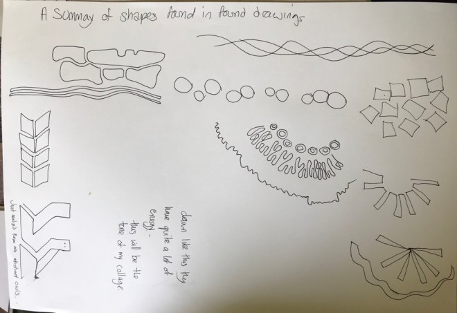


 Meandering
 Flowing


