Demonstration of technical and visual skills – I think that within the context of responding to a brief with ideas rather than completed pieces of work that my technical and visual skills have been competent in representing ideas I have used a range itfirmlyobvious techniques, I was really pleased with the outcome using found materials joined using stitch to represent the landscape and also with the way this work linked so well with my research.
Quality of outcome – apart from ex 1.4 which caused a complete blank I have responded well to the tasks and have hopefully shown some interesting concepts that are well communicated. I feel that I got o a real roll with MMT and have stumbled my way somewhat through assignment one. I think that I got used to being far more process led and am coming round to a different way of thinking for I&P
Demonstration of creativity – mixed responses to the exercises, I felt that my response to 1.1 was quite strong – it being process led helped, 1.2 personal experience was engaging and with a lot more time I think that I would find a lot to develop her, also 1.7 I respond far more to place than the exercises responding to words – it’s just occurred to me that the drawing of bird paths could be titled ‘flight’ , words can perhaps be a trigger for my ideas – I have a feeling that all of these stands will start coming together with further practice.
Context – I can see an improvement in the communication of my thoughts over the last two courses but I can see also that this is an area that I need to develop. My understanding is growing thanks mostly to the critical thinking skills course with Rebecca Fairley but I need to record my thought process in more detail.
I don’t know the place that I live particularly well , I have however been fascinated with the constant change of my garden view, by month, by day, by hour, by minute.
South facing so during the course of the day tha shadows reverse completely. Surrounding hills cast shadows, causing different parts of the far landscape become illuminated. I’ve been a city dweller and it’s a complete treat to observe the changing seasons. I am changing season.
I’ve made a few disappointing forays into capturing the view as drawing practice and photographs. For this exercise I made an incredibly bad representation in watercolour. It did enable me to observe the horizontal layers and placement of oval shapes.
Collage – found paper textures.
I used Different papers that represented parts of the landscape, inside of envelopes for the sky (airmail?) – tenuous?) I used crumpled paper hills, newspaper for trees on the distant hills, crumpled and ripped water meadow as opposed to the flat lawn, squared paper block paving, pleated plants. I used translucent paper for the tree foliage to emulate the way you can see the landscape behind it, creased to represent branches.
Not a sophisticated collage, I like the sky and plants create a good sense of depth, the creased branches work well. Collage was a suitable technique to represent the range of textures in the landscape. I kept it simple as I didn’t want to make it too busy, it could work well in only textures of white paper, or using different fabrics and joining them in different ways (developing the outcome in ex 1.1) I enjoy the shadows cast by the creased plants , I’m not aware of too much 3D collage – this is something that I can research further.
Back drawing using inked plate and mixed mark making tools.
I enjoyed experiments with print on MMT. I tried a few monoprints before the above back drawing. The ink wasn’t lifting well off the metal plate and then I remembered the back drawing technique so reined and used my fingers and other implements to draw. This drawing is a little dark, there was shadow on the hilll tops but a much narrower and subtle band. The paving slabs form a great stage to observe the rest of the landscape. I find the tree and bush in the foreground quite effective, particularly the landscape showing through the tree foliage, the fence mid distance is too big and bold. In the accompanying ghost print I feel that the sky and hills are very atmospheric. There is a fabulous edge at the bottom of the lawn. Back drawing is a suitable technique for the landscape as it evokes atmosphere and adds textural interest to the main components of the drawing.
Bird paths – ink on drafting film.
This drawing excites me more than the others. Whilst drawing the landscape ,different birds visited the garden and flew overhead. It struck me that as a key part of the eco system they were sort of stitching the land together. For one of my final samples for MMT I carved a representation of a journey onto a plaster egg. I developed this theme for representing place by laying drawing film over the collage and mapped the path of birds coming and going. This drawing is quite messy to look at, however It is very energetic. I feel that there is a lot of scope for further exploration. I have jotted some ideas in my sketch book.
Building on this idea I set up a feeding station for the birds using paper and carbon paper – I had a fancy that they might make marks with their feet and beaks while eating, not successful on this occasion but I’m still intrigued by the process
I realise that I’ve used a portrait composition rather than a more obvious landscape, it’s the view framed by my doorway rather than the wide view from my garden. This was practical as I could work from life. I think it give my drawings a feeling of withdrawing, definitely an observer of the landscape rather than a participant in it. This is interesting because it is I realise an accurate impression of how I feel. Unintentional as I was trying to capture the beauty of the place.
I could have chosen a smaller place, the cocoon of my hammock, the space around my meditation chair but I felt that ‘place’ was big, I did the same with the personal experience task in ex1.2 taking a whole valley – this is an interesting observation, I may be missing opportunities by always looking at the macro rather than micro. This is something to consider moving forward through the course.
I’m not hugely impressed with my first outcome as a painting but I think that’s to be expected as I’m not a painter or well practised with water colours.
I’m listening to The soundtrack to the film The Fountain by Clint Mansel It’s my go to classical album, I’d like you to imagine driving through Norway for example, eating up the miles of mountain road and rugged empty coastline, glacial and majestic. The music is moody, dramatic double bass, cello and violins with a deep thumping bass drum. This morning the fog has closed in and the day is damp and somber.
I chose watercolour as I thought that watercolours might give a moody ethereal effect.
The still life started grey, not black and white grey but purplish and greenish, fascinatingly, a ray of yellow appeared and then a bright rust occurred. It was really interesting how the music drew me in away from distracting thoughts and then instructed my choice of colour with sudden bright moments.
I certainly felt influenced by the music, the background was wetted and then I flowed the purple grey onto the page like a conductor. Colour accents were instructed by changes in musical mood, I worked really quickly to the rhythm of the piece.
I could have stopped sooner, there was a point when the colours were suitably morose but not to muddied.
Second interpretation to Once in my life from The Decemberists album I’ll be your girl, the track starts quite gently then an optimistic string orchestra kicks in, the vocals are quiet melancholic the music triumphant. It got very colourful and quite ——-.
I felt like I needed a much larger piece of paper – it’s not often that I’ve felt constrained by page size. I need a big empty room with massive canvases and lots of paint and powder that I could use with my hands. I was put in mind of Jessica Warboys huge canvases that she makes with the sea.
Third interpretation Fast car by Tracy Chapman da da da daaaa. … An old favourite that often returns for a visit. Music is so very powerful and interpretation incredibly linked to current emotional states. I was searching my music collection for something uplifting yet calm. I used oil pastels, as it felt like a smudging sort of groove, warm and mellow, the background of yellow and blue is really uplifting , there is a halo effect like the resonating acoustic guitar ringing, the vessels particularly the jug are strong and clear. Some melancholic shadows crept in and I was moved to add strong outlines – not entirely sure what drove that!
I worked from a simple sharpie drawing. Without added colour or shade. I became more confident at drawing the shapes and also more relaxed about the exact placement so my 3 interpretations are slightly different.
I think that the music influenced colour more than the movement of applying the media. Movement was influenced more by the type of medium. This exercise really highlighted my inexperience with handling different mediums. I think that my observational drawing is becoming more confident and clearly experience and practice will improve confidence with choosing and handling different techniques.
I looked at the still life drawing s and paintings of Giorgio Morandi
I appreciated the way he used simple objects as a mechanism to study colour and composition. It seems similar to the way Rachel Whiteread used simple everyday items to investigate surface.
I selected a jug,bowl,bottle and two cups, cleared the table and stuck an a2 pierce of paper on the window as I don’t have a large drawing board. Studying the composition I found it difficult to work out the composition so made a viewing window to help place the objects on the paper.
As the paper was larger than I’m used to working I chose a chunky 6B graphite pencil, I feel that this drawing was reasonably successful as an experiment in composition, as I was standing up and looking down on the still life the ellipses were quite a prominent part of the drawing. I squinted to work out the highlights, shadows and mid tones. The objects are slightly floating on the page but it’s not a bad first attempt.
It was awkward leaning on the window and looking to the left at the still life so for the second drawing I taped the paper to the drop leaf of the table – landscape this time – by sitting on a stool I had lower viewpoint and this change the proportion of the composition. The top of the bottle is flat, the bowl elliptical and the cups have a little eclipse. I chose charcoal to create more tone areas. I haven’t used charcoal for ages , I enjoyed the process of smudging and worked quite quickly to cover the page. More successful to lay I think and less busy with less eclipses.
An even lower viewpoint – no eclipse at all on the cups, almost looking up at the objects , a mouse eye views
The birds were singing so loudly! I just had to respond to their joyful sound.i was drawn to use pastels and blend them with my fingers.warm rich tones.sunkissed.
I think that this is the composition that I will use, it is clean, familiar in that it is the height I would normally view the objects at – I hadn’t considered before that ones height would affect how an object is seen, but it’s obvious really!
I find this composition very busy, your eye has to travel up and down with no clear pathway around the picture.I like the transparency of the bottle and the more confident clean lines. I think that the cup ellipses are too much like two eyes. I wanted to try a portrait rather than landscape, I can’t say what but I prefer the landscape orientation, I think that it works better with the proportions of the shapes.
Review – Does it answer what is being asked of you? how can you develop your ideas ? What are you trying to achieve in your samples/ art ? have you achieved it? if not why? how can you revisit the work to improve.
I am much more comfortable with this doing task, the thought of manipulating paper in many different ways is comfortable and appealing.
Dissolve – not strictly manipulating paper I now realise, but using the properties of paper to manipulate ink. I expected the tissue paper to dissolve in water ore than it did. I could experiment with use of detergents or temperature of water perhaps.crumple – a positive and negative image using a corrugated card template and thin crumpled tissue paper.
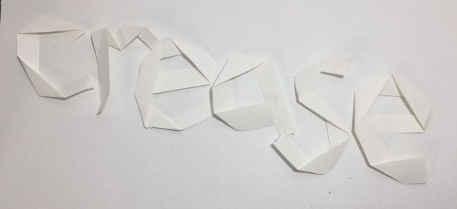
creasing paper and folding it into letter shapes.
Creasing letters into paper – I’ve recorded these in my sketchbook.
I especially like the idea of peeling away layers of bill board to create words…
This was excruciatingly difficult, my mind was blown by the choice, my brain worked overtime – it was like that annoying endlessly spinning icon on the computer uploading but not uploading. Every now and again a pause, an option, then decision paralysis.
Some options – an endless trawling through my many many cds, lots of snips of songs, reminiscing…. some great ideas for techniques though – collage, woodblock prints, collage, photography, abstracts, typography……..
A favourite book? Where to start?
Song lyrics – there are some really dodgy lyrics in the Folk world – I almost worked with a song about Leda – the images I googled were out of my comfort zone!
So many images rushed through my mind about different songs it was really hard to pin down – many I was put off by the very thought of including figures – terrifying to draw!!!
The drawings for this exercise are now in my sketchbook


 I like the transparency of the bottle and the more confident clean lines. I think that the cup ellipses are too much like two eyes. I wanted to try a portrait rather than landscape, I can’t say what but I prefer the landscape orientation, I think that it works better with the proportions of the shapes.
 crumple – a positive and negative image using a corrugated card template and thin crumpled tissue paper.